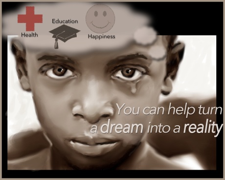
This PSA is very cool. I like how the photo got rendered into a painting, so it looks very realistic, but the drawing aspect gives it this otherworldy quality. Another great part is that the eyes are some of the darkest parts in the entire PSA. This really gives the feeling that the child is looking directly into the viewer’s soul, begging for help in making his dream become a reality. Your use of a transparent thought cloud is also very interesting, because the images displayed in it directly play with the “you can help turn a dream into a reality” and also encourage the viewer to donate.
This PSA Ad is very moving. I looked at it and thought wow. The raw emotion that the boy’s face brings, speaks more words that you could have written and you recognized that by only putting one line of text in the Ad. The colors of the Ad give it the sad, hopeless connotation and that is the exact emotion you want your viewer to posses. My only critique is the Health, Education, and Happiness it is a little strange. It took me a while to figure out that is what in a thought bubble. I get what you are getting at and it makes sense but in comparison with the rest of the Ad it seems a little out of place. I think what the child is thinking or wanting as his dreams are implied by the rest of the Ad.
I really enjoy this ad. I think it is very moving and the paint effect ads a lot of emotion, especially with the tear at the child’s eye. What I think you could do differently, however, is adding something about the DHAF specifically. It is unclear through this ad what the audience is expected to do specifically or who they are supposed to donate to. If you could ad a logo or just something about the Dr. Hawa Abdi Foundation I think the message would be a lot clearer and it would stand out. But other than that the ad is really good and very inspiring.
I really like this ad. The use of the painting effect on the photo creates a very moving image that almost seems unreal. I also really like the overall meaning of this ad. However, it is a bit difficult at first to tell that the thing above the boy’s head is a thought bubble. Maybe make it a bit clearer somehow? Maybe outline the thought bubble or make it have sharper edges; just something that will make it more recognizable. Also, you need to add the DHAF logo to this. Nowhere on the PSA does it say what the organization is. If you could find a way to incorporate that, I think you’d be set.
This PSA ad is very effective in moving donors to donate. There is emotion in this ad as opposed to pure information. Emotion will always move people more than facts and this ad is on top of that, very well done. I really like how it’s turned a photo into a painted medium. This technique ads an artistic element to the ad that makes it pleasing to look at. The only thing I think could use some adjusting is the placement of the cloud containing the education, health and happiness symbols. I understand why it’s there and what it’s trying to achieve but I think it seems a little cramped in the composition of the ad, if the frame of the ad was extended I think it would work much better.
Your poster provides a vivid message and you make it clear that people need to help, but there doesn’t seem to be much a viewer can do directly, and I don’t see anything referencing Somalia or the Dr. Hawa Abdi Foundation. Was this intentional? Either way, I like the photo editing, but the colors on the cheeks and nose may be a bit over done.
First off the, the editing of the image is really great and you can definitely see all the technical skill that you have! Great job, the image is really powerful and great. That being said, the way the image of the boy is edited I don’t think that it works well with the DHAF. Because of the editing the boy looks a little sci-fi-esque which doesn’t really correspond to the DHAF. But I really love the idea of the thought bubble and the slogan. As well, it does not give any information on DHAF as an organization or motivate viewers to donate to the organization. Great photoshop work though!
The purpose of this ad it to encourage donations to DHAF. By showing a picture of a crying child, this ad effectively pulls on the heart strings of its viewers. The filter used on the photo of the boy also creates a somber feel that helps the ad. The simple colors and text create a powerful message: YOU can help, donate. The cloud around the three icons at the top is a bit out of place, and the ad also needs to include information about DHAF, even if it’s just their website url. With a few tweaks, this ad could be used very effectively by the organization.
This ad is really powerful in the implementation of the of the photo of the crying boy. this really brings out the emotional side of the ad and the humanitarian aspects of the DHAF foundation. This really ties in well with the slogan to portray the call-to-action message to viewers. The small icons at the top are a little awkwardly placed in the photo; however, the ad as a whole really does help present the human issue that the DHAF faces every day. Well done!